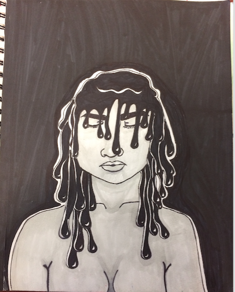
 Look at this another band related visual journal page. It should be known by now that i am a human dumpster and I like music WAY to much. I drew Inspiration from the song forest by Twenty øne Piløts. I think that this was an okay visual journal page. i was trying out watercolor pencils and was trying to see how they work. if i was to fix it i would change the media because i don't think it looks too good.
0 Comments
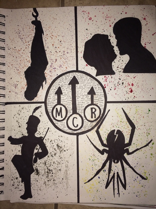 My inspiration for this piece comes from both another piece of art and also one of my favorite bands. Yes another band related art piece. The silhouettes come from all of their album art through out the years of them being together; and they are surrounded by the colors that are in their album cover. In the original art piece that i saw this off of some things were very different than mine one being that their splatters were much larger than mine. second being that they cut out their logo out of something with words already on it where is i drew it and picked my favorite song and wrote it down. lastly some of the colors are different mainly in the top left and bottom right. The media i use was alcohol based markers and water color. Even though my splatters aren't huge and as eye catching i still thing it does its job. I learned in the process of making this that splattering doesn't always have to be so proper and clean and that if you want to have something big and eye catching you have to load up more water and paint and splatter and drop color to get that effect. During the time of me making this we had just about started our dive into water color and i was checking out some different techniques with watercolor that i haven't done already. Like in Visual journals ahead i have many different water color pieces that have gradients , backwashing and smooth blending that took a while for me to pick up but i got there. I was a bit iffy on wether or not i wanted to upload this page since i feel to others looking at it there isn't enough on it to make it visually interesting but this piece is all about trial and error because its my first time really trying out watercolor and its okay not to get it right on the first try. but if i were to change anything about it i would make my splatters bigger so you could see all the color.
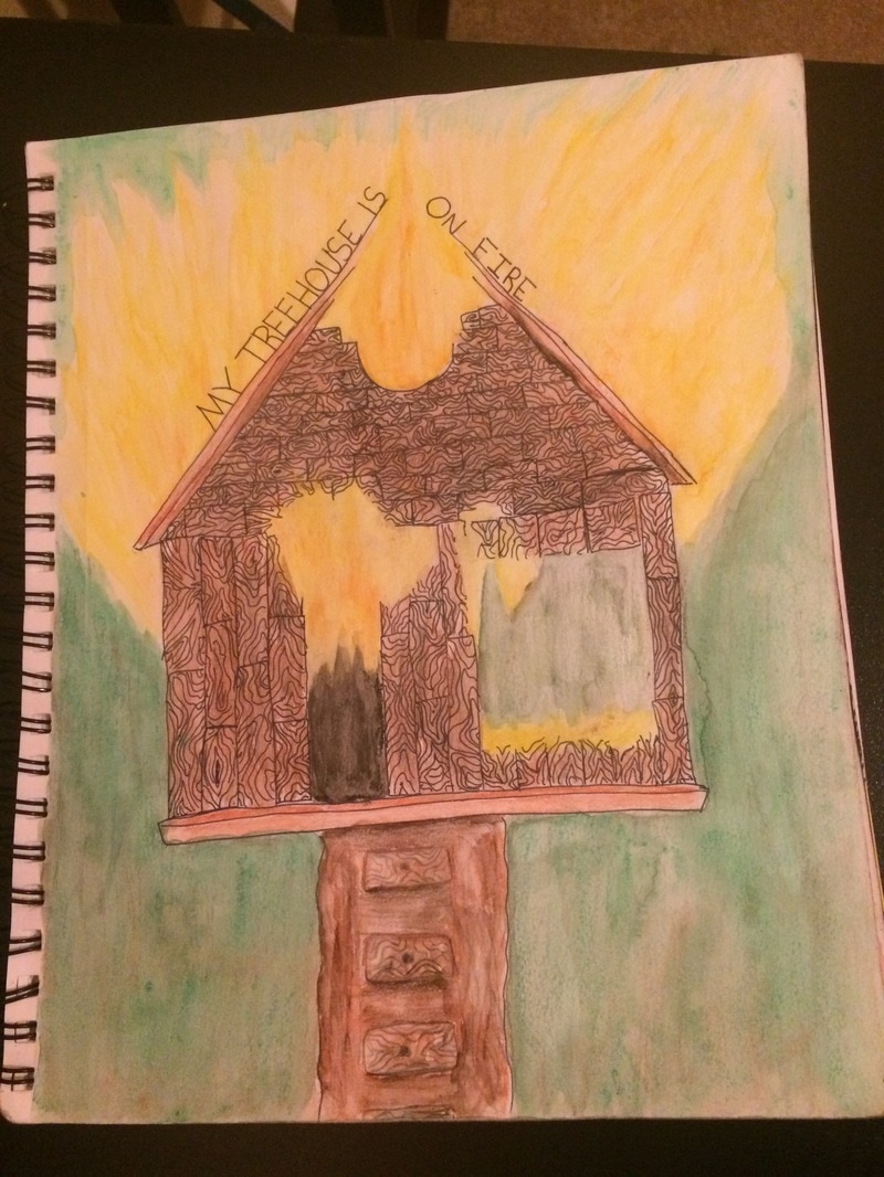
 This is my 6th journal page. its theme was "melt your headaches and call it home." I was inspired by the song Northern Downpour by Panic! at the Disco. Another band related art page. I get my biggest insperation from music since I lisen to it as much as i can. I even have a special playlist of song that have given me insperation for some art pieces.
I was very proud of this because I think it turned out well considering I was using a medium that i normaly dont use. I used aclcohol based markersand Sharpies to make this. I layerd two different grey colors to give it deffinition in the places where it needed it. The black was used for the hair and the background. Overall I think it turned out well but if I was to do it agian I would maybe paint the black background because you can see where I picked up the marker and put it down and if it was painted a solid black it would probably look better. 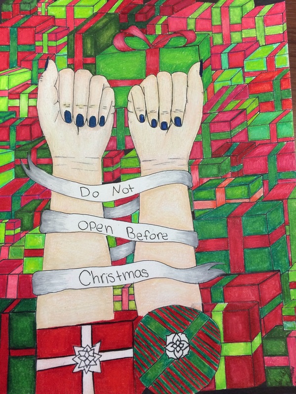 Hey look at that another visual journal piece that is band based. By now everyone knows i'm a human dumpster and I like bands more than anything. For this piece I was inspired by the song "Our lawyers made us change the name of this song so we wouldn't get sued." (Yes that is the name of the song) More specific the lyric that says " the ribbon my wrist says do not open before christmas. over all I think that this piece came out really well but maybe I have worked a little more on blending the color. Also I would touch up some of the lines on the presents since some of them are kinda weird. I think I took a few risks with this one one of them being that I did something that i know would have token a lot of time. it did take a long time to do and if it was due last week then I wouldn't have finished it on time. Overall I am pleased with the outcome it turned out really goof and the way i wanted it to cmae out.
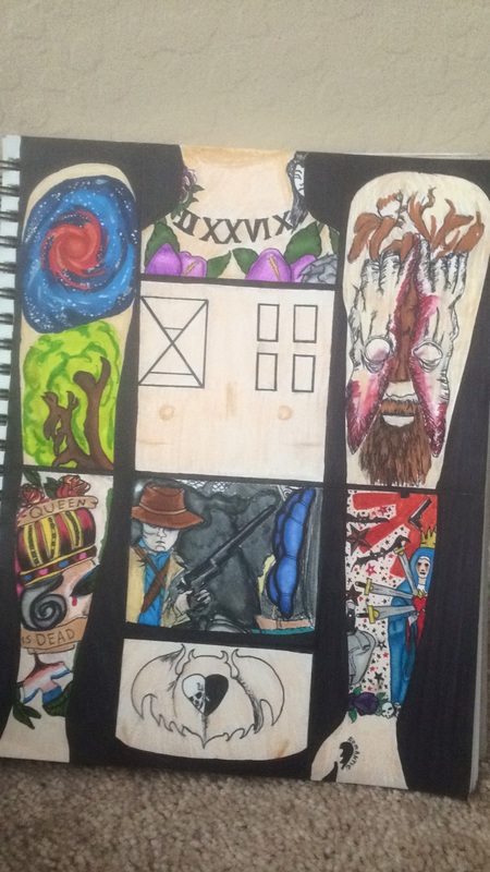 My theme for this art page was inked freaks. I drew inspiration form some of my favorite band members from my favorite bands. I ended up drawing there tattoos and placing them in a some what body form. The medium I chose was water and alcohol based markers and fine liner pens. over all i do like my piece i like the colors a lot and I am very pleased with my blending since I'm not that great at using markers. If I was to change anything I would definitely look more in depth for photos of these peoples tattoos because sometimes id have a general idea of what there tattoos look like based on couple blurry or not full photos, but them when actually going in with marker and looking for better pictures of the color i realize that something did was wrong like the color or the tattoo in general.
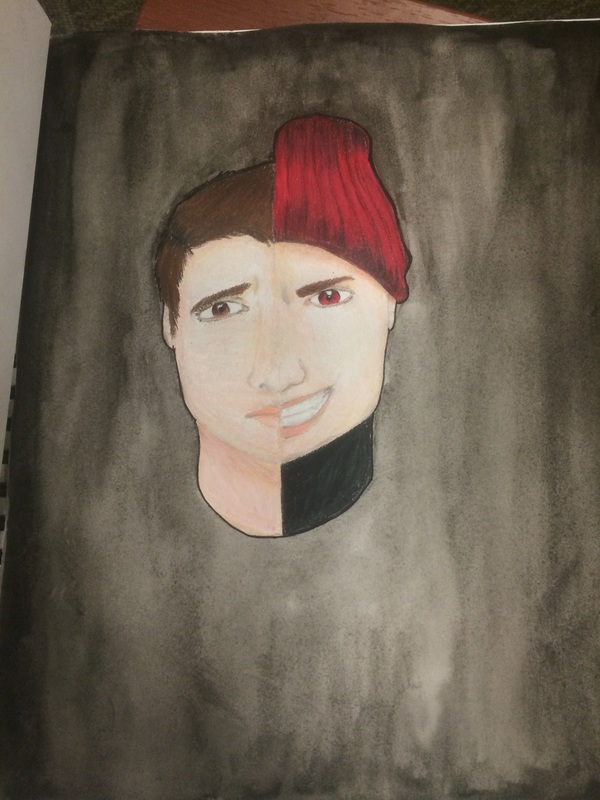 For this visual art page I took inspiration from the song "Goner" by Twenty One Pilots. I used prismacolor pencils and black watercolors. When I think of the things I could change about the painting I would probably blend the left side of the face better than it is. I think that that side of the face is very spotty from the white in the page and where I went over it with prismacolor pencils. Also in my original idea I wanted to put the quote in the picture but decided against it and i'm thinking now that that wouldn't have been a bad idea. I do like the over all concept of the picture and I do like how the right side of the face turned out. I also really liked the water color I did and how it made the picture darker the way I wanted it to at least.
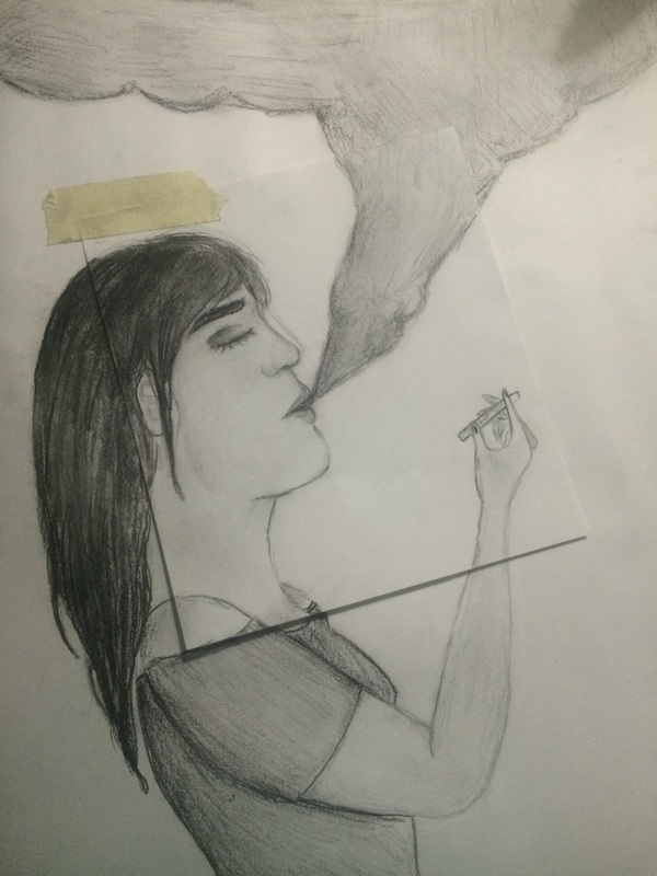
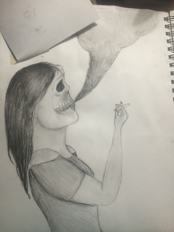
For this page I chose the the Theme Bad Habits Die Hard. This portrays someone who has the bad habit of smoking and how they look like on the surface and what they are on the inside which is dying. When I think of the good things about this piece one them is that anyone can determine what i wanted to pot ray without noting what the theme was. Media wise I think when I was doing smaller details in the skull with the charcoal i think that turned out the best. When it comes down to what I could/ would change would be putting in a more smoke like effect with the smoke. I would also try to hide the tape side it sticks out like a sore thumb. Lastly on a technical and style level I think i should have worked more on the human face and the hands.
 My topic/theme was follow the yellow brick road. I think it came out okay in the end. if i were to change anything about it it would be the dark ground of the painting. id probably create some value so it pulls more attention to that area instead of just being one toned.
|